DIRECTOR'S EDITIONS
EDITORIAL DESIGN | 2019
A series of publications highlighting some of the best directors in Hollywood by encapsulating their thematic styles and the tones that recur throughout their filmographies.

DURATION
2 weeks
MY ROLE
I was responsible for the entirety of this project, from conceptualization to execution. Feedback I received from my peers and professor were instrumental to the development of these books.
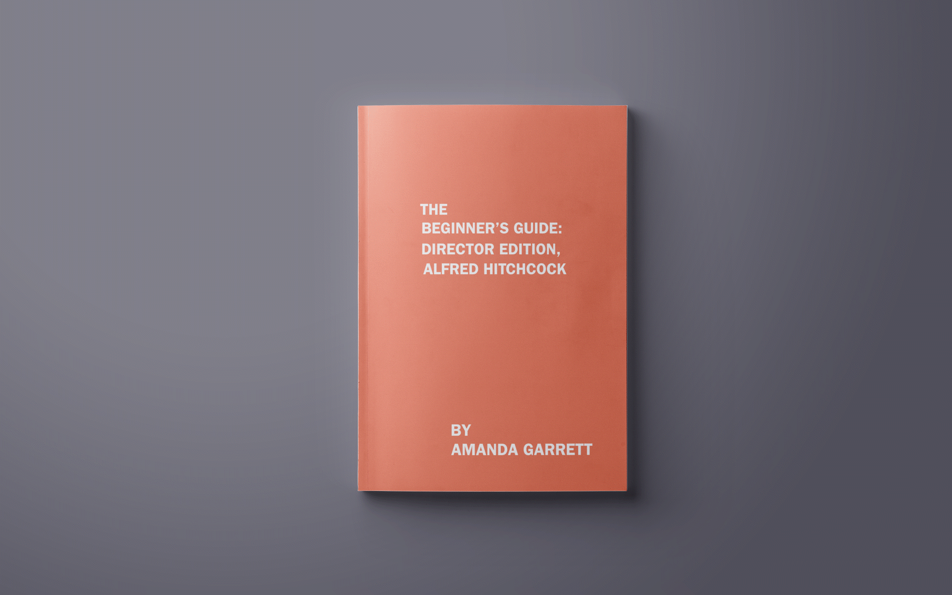
ALFRED HITCHCOCK
This publication was inspired by the posters from some of Hitchcock's most iconic films; Vertigo and Just Dial M for Murder, as well as his themes of danger and suspense, which inspired the typographical choices and the color palette. The narrow columns of text are reminiscent of his simple yet dynamic style of story-telling, which is making something multi-faceted with a few, basic elements, as seen in Rear Window.
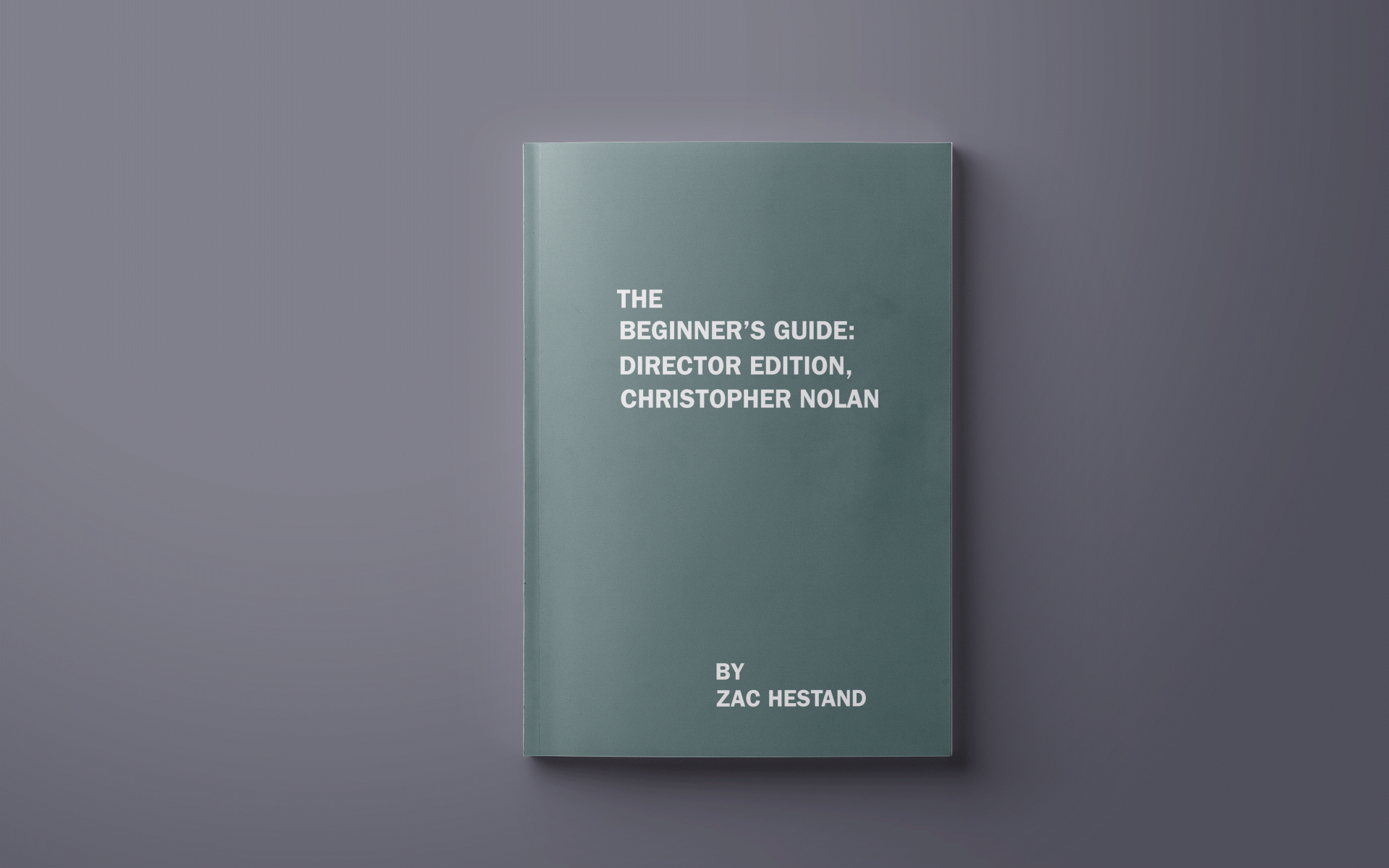
CHRISTOPHER NOLAN
This publication was inspired by Nolan's signature style of film-making. To represent his themes of identity and doubles, as seen in Inception and The Prestige, I used multiple fonts and contrasted each alternate page to create a dynamic sense of repetition. Another staple element in his films, is his non-linear way of story-telling. The offset emphasized text is a break from this publications' set guide of narrating content.
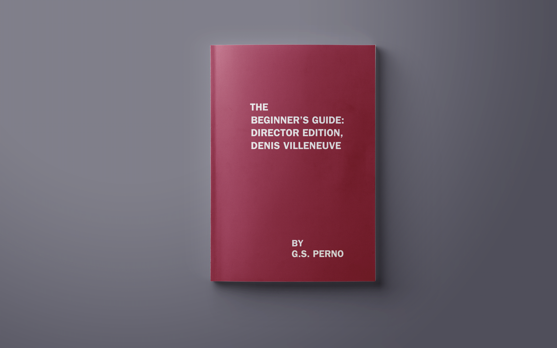
DENIS VILLENEUVE
Villeneuve is known for his dark, psychological thrillers complete with a mind-blowing plot twist. To encapsulate the tone of his films and the strong visual aesthetics in them, I chose to use a stark color palette. The flipped text plays with his themes of chaos and twist endings as well as the introspective nature of his films, as seen in Enemy and Prisoners.