ZOOM FOR KIDS
PRODUCT DESIGN | 2020
Zoom has become of one the most well-known and globally used applications in regards to video and audio conferencing. This project aims to redesign Zoom in the COVID era, to make remote learning more accessible for children (aged 6-10 years) and their teachers.

DURATION
4 weeks
PROJECT PARTNER
Suditi Shah
MY ROLE
The work was evenly distributed between my teammate and I. I was responsible for conducting user research, creating user personas, designing user flows and wireframes, and creating prototypes.
CONTEXTUAL OVERVIEW
The outbreak of COVID-19 forced millions of students world wide to leave the traditional classroom setting and attend online class from home. While there are other platforms, Zoom is popularly being used worldwide due to its appropriate functionality and ease of use.
However, young children face the greatest challenges while learning remotely. It hinders development of social skills. Teachers too find it difficult to keep students engaged for the class duration. This project has aimed to redesign the interface of Zoom for children in order to solve the most fundamental problems faced by them during this time.
IDENTIFYING THE PROBLEM TO SOLVE
There were multiple pain points that we were eager to explore and solve. However, we realised that the popularity of the application was partly due to its ease of use. Thus after research, it was clear that the application needed to maintain its simplicity while incorporating efficient functionalities.
THE PROBLEM
Young students find it more challenging to focus on a screen as opposed to the sensory experience of being in a physical classroom.
The reason being is that they're in a less immersive educational space and learning through physical hand-gestures and in-person interaction is hindered. Zoom lacks features to allow students and teachers to foster 1:1 relationships or track their progress during class.
CREATING PERSONAS
We wanted to observe students and teachers from varied countries engaging in remote learning in order to create a broad solution. However, the short project duration alongside COVID-19 meeting restrictions prevented us from conducting physical observations. Thus through online research and phone interviews with the student's parents we created two user personas.


USER FLOW
Starting by beginning with creating the teacher interface user flow helped inform design decisions for the student interface. The aim was to have teacher's take control over the meetings completely while students merely follow the instructions on the screen.

DESIGN PROCESS
We worked on low-fidelity wireframes. We explored ways in which the Teacher’s and Student Screen could showcase a strong relationship with design consistency yet be suitable for their individual purpose. One of the toughest challenges in designing this was finding a way to make the new added features seem intuitive and less intimidating.
Next came the high-fidelity development stage. The visual design had to be simple, appealing and engaging. The rules we set for ourselves were that the color-scheme and iconography had to represent a primary classroom in order to inculcate intuitiveness and engagement within the app.

VISUAL FLOW
Since this was a redesign project, we already had a structure to follow. All we had to do was maintain visual consistency and embed the new features among existing ones. While there is a visual distinction between the teacher’s screen (dark mode) and the student screen (light mode) the iconography is largely similar.

PRESENTING ZOOM FOR KIDS
STUDENT VIEW

1. INTUITIVE FUNCTIONS
The aim is to make a simple interface that prompts students to easily join meetings and communicate.
2. DISTRACTION-FREE ENVIRONMENT
Focus-driven environment created by redesigning the default view. The teacher is viewed on a larger screen at the bottom, whereas peers are viewed in smaller windows on top. (The default grid ‘Gallery View’ can be overwhelming and distracting at times)


3. PROGRESS AND ENGAGEMENT
Child progress can be viewed in the weekly report section that teachers fill out. This helps teachers understand how engaged students are in their class.
4. THOROUGH COMMUNICATION
One way chat feature. Students view the teacher’s announcements in large type at the center of their screen. The timed check-ins ensure every student is paying attention to the teacher.
TEACHER VIEW

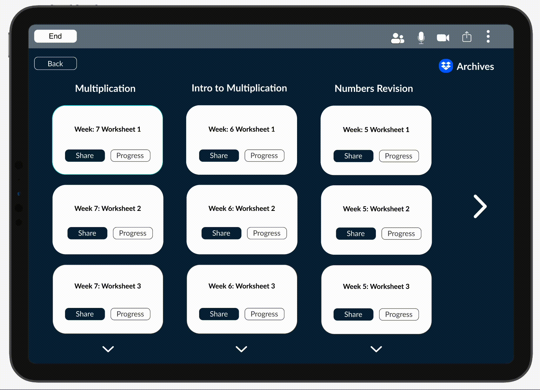
5. PROGRESS AND ENGAGEMENT
Tracking progress of students can be done by creating weekly reports. This is the same report that can be accessed by parents.
6. UNDERSTANDING STUDENTS
Teachers can understand student’s pace and ensure they are productive in class via the interactive worksheets feature. The screen shows the percentage of the worksheet completed by the students.

7. SMOOTH FUNCTIONING
Time lag when sharing screen to view videos has been solved by linking video sharing apps, such as Youtube and Vimeo, to Zoom.
8. FOSTERING MEANINGFUL RELATIONSHIPS
Break out room discussions can be monitored by teachers as they can view all rooms (on mute) and then decide if they want to join a particular room.

CLICK THROUGH PROTOTYPE